


The Step-by-Step Guide to Building Stellar ExtraHop Dashboards
Back to top

April 9, 2015
The Step-by-Step Guide to Building Stellar ExtraHop Dashboards
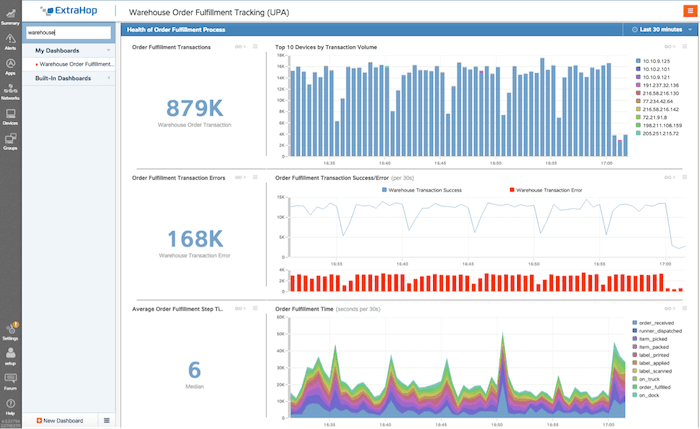
A custom dashboard built to track order fulfillment in a warehouse. In this post, we will show how to build a custom dashboard like this one.
At a recent ExtraHop user forum, users asked for guidance in creating dashboards. Here in the ExtraHop Technical Marketing Engineering (TME) group, we have a methodology that has helped us successfully organize and create dozens of dashboards. The cycle we go through is design, explore, implement, use, and iterate.
Using such a methodology and exploring the interface, dashboards are not only easy to create but also fun. It's amazing to watch your data come alive and tell you things that you didn't know before. As always, the ExtraHop platform Web Users guide is the complete reference on dashboards: https://docs.extrahop.com/current/web-ui-users-guide/.
What Are Dashboards?
If you would like to create a dashboard while reading along this post, sign up for our [free, interactive online demo](/demo/) and follow along.
What Does a Dashboard Look Like?
Let's break down the components of this dashboard:
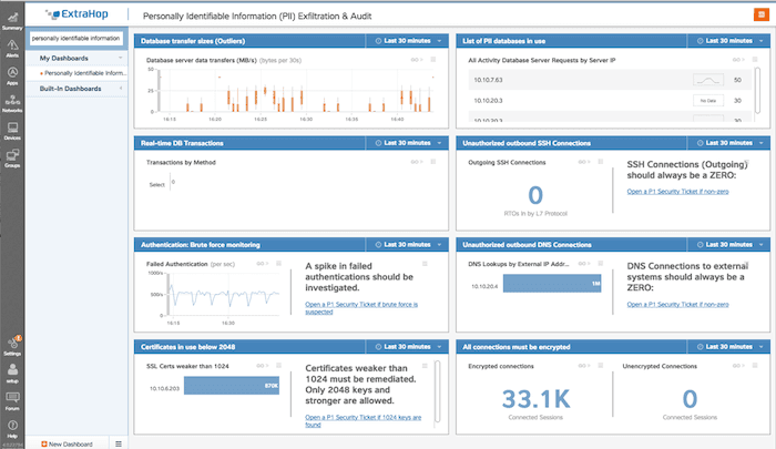
- "Database transfer sizes (outliers)" – This shows the average transfer sizes in the database. Alert condition: A spike in database transfers would be unusual and warrant and investigation.
- "List of PII databases in use" – A list of all of the databases with PII in use.
- "Real-time DB Transactions" – The actual database queries taking place.
- "Unauthorized outbound SSH Connections" – Outgoing SSH connections are prohibited from databases. Alert condition: Any non-zero number.
- "Authentication: Brute force monitoring" – The rate of authentications in the environment. Alert condition: A spike in failed authentications would warrant further investigations.
- "Unauthorized outbound DNS Conenctions" – Show any external DNS lookups. Alert condition: Any non-RFC 1918 DNS servers in this list.
- "Certificates in use below 2048" – All certificates in the environment should be 2k or higher for this environment. Alert condition: Any certificates weaker than 2048 must be investigated immediately.
- "All connections must be encrypted" – Display the traffic for all encrypted and unencrypted connected sessions. Alert condition: If there is any unencrypted traffic, it should be alerted on immediately.
How Did We Build a Dashboard Like This?
Design Phase
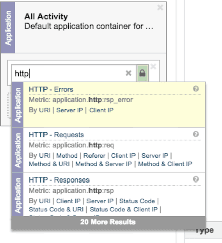
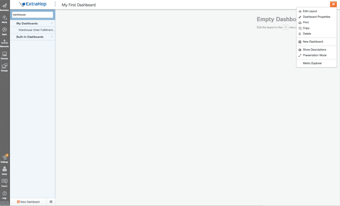
1) The Metric Explorer
Accessing the Metric Explorer allows you to explore any of the thousands of built-in or custom metrics in the ExtraHop platform.
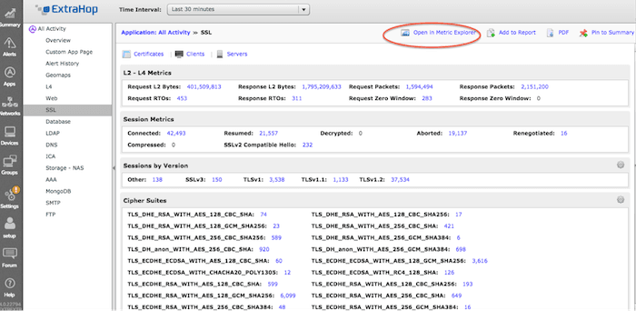
2) Browsing ExtraHop pages and charts
Browsing ExtraHop pages is another good way to find metrics you are interested in and then add them directly to a new or existing dashboard.
3) Creating and committing a custom metric
ExtraHop Application Inspection Triggers allow you to create and commit a custom metric in a matter of minutes. These custom metrics can then be used in any dashboard. See this useful post on metric types and the trigger documentation: https://forums.extrahop.com/t/tip-of-the-week-metric-types/291
Implementation Phase
The dashboard creation flow is to first create a region, then to populate that region with an object, and finally to configure that object.
1) Regions can be used to delineate time zones and define visual layout. For example, some regions can be tracking time deltas (this week today versus last week today) while another chart could be looking just at the last 30 minutes, 6 hours, or other time period.
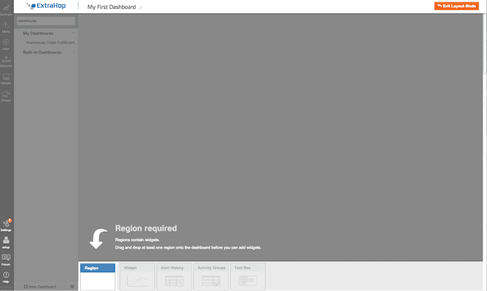
2) After a region is created objects are added to the region. The available objects for a region are: widgets, alert histories, activity groups, and text boxes.
3) Widgets are the primary object type for metrics. Drag a widget into an area to create a chart. The available types of charts are: Area, Bar, Column, Candlestick, Line, Line and Column, List, Single Value, Status.
Look back at the example PII dashboard above. We are using candlestick lines for database transfer sizes because candlestick lines show average values very well—an outlier will be easy to spot. We are using a single value for unauthorized data connections because that value should always be zero; again, it will be easy to spot an outlier if the value is non-zero. We are using text boxes (formatted using the Markdown language) to explain the values and what actions to take for operators and administrators.
Try different metric types and see which ones fit your data best.
Usage and Iteration Phases
In future blog posts, we will deep-dive into individual widget types and explore when and were each may be best.
For now, watch this video to learn how to create a new ExtraHop dashboard from scratch:
Check out this video for a walk-through of dashboard creation in ExtraHop's UI.
Discover more


Sr. Technical Marketing Engineer
Nojan joined ExtraHop as a Sr. Technical Marketing Engineer in the summer of 2014. A veteran of Internet technology companies, he has been involved in one way or another with data over wires for over 30 years. While his hobby in networking began in 1984 with a 300 baud modem, his first paying job didn't come until a year later in 1985 when he started maintaining accounting systems on an Apple II for a local pharmacy. From there, his career in the industry has involved operations and system administration for consulting companies, for his own startup, and work for larger companies such as Apple, AOL, Seattle Times and Real Networks and vendors F5 Networks and Cisco Systems. For Nojan, the promise of ExtraHop is the promise of a platform that makes life better for every developer, operations analyst, network engineer, and system administrator, a world where knowledge is power provided by ExtraHop.