


Guide to Building Stellar ExtraHop Dashboards, Part II: Chart Types
Back to top

April 27, 2015
Guide to Building Stellar ExtraHop Dashboards, Part II: Chart Types
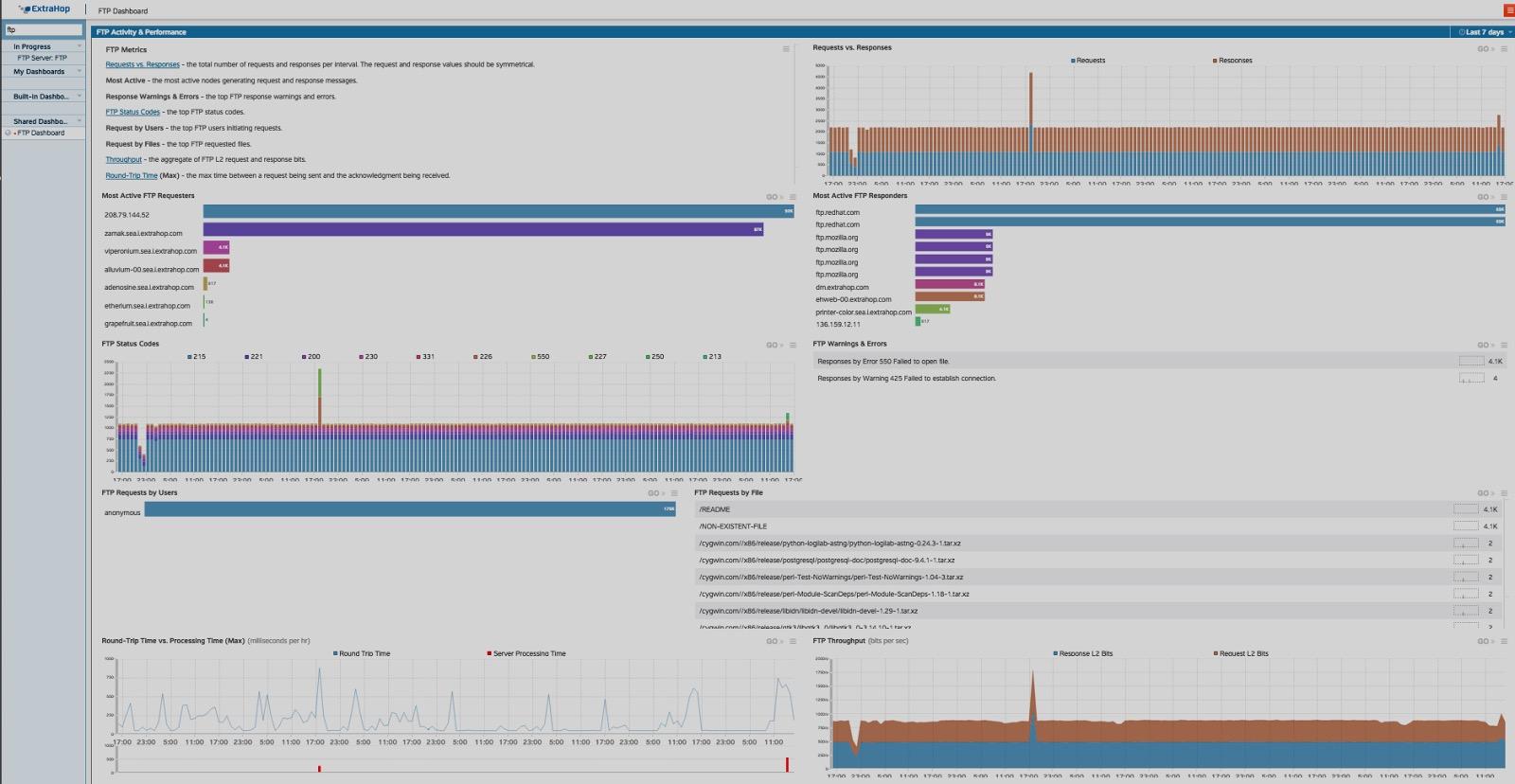
A custom FTP dashboard</a> built to display essential FTP metrics.
Previously in this blog series:
In part one of this blog series, The Step-by-Step Guide to Building Stellar ExtraHop Dashboards, I walked through using ExtraHop dashboards and their fully customizable HTML components. I covered how you can start to build dashboards using any of the thousands of built-in ExtraHop metrics, and I talked a bit about using Application Inspection (AI) triggers to build custom metrics.
In part two, I will take a deeper dive into the chart types that are available to you as a user and when to use which types. As always, the ExtraHop platform Web Users Guide is the complete reference on dashboards.
If you would like to explore ExtraHop dashboards and experiment with dashboard types while reading along with this post, sign up for the interactive online demo.
Which Chart Types are Available for Metrics?
The following are the available types of charts for ExtraHop dashboards:
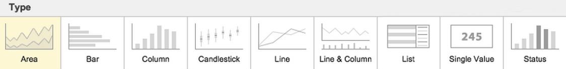
Area, Bar, Column, Candlestick, Line, Line and Column, List, Single Value and Status charts are all options for your ExtraHop dashboards.
While these chart types are intuitive, there are some subtleties that make certain chart types the better choice for some situations. Let's take a deeper look into the charts, starting with easy example: when to use an area chart versus a bar or column.
Area Charts vs. Bar and Column Charts
I am interested in creating a dashboard to track the HTTP metrics in my environment, specifically, which URIs are popular and how many times they've been accessed, so I've created a device group with all of my webservers and I've selected "HTTP Server Responses by URI." Now I have to choose the type of chart I want to show the data. I can choose to display the top 20 URIs or I can use a pattern match to single out certain paths (I can of course create as many charts as I'd like but I will stick with just one here). Each of the chart types are going to give me a different experience so the questions are: 1. Do I want to interact with the chart or do I want to get information at a higher level? 2. Do I want to create an operational dashboard or an analytics tool for myself? Once I decide exactly which information matters most to me, I can more easily choose the chart type that will surface the important info fastest.
Area Chart
The area chart lends itself to real-time analytics exploration, with a highly interactive experience. In one view I can see the Top 20 URIs, their rate, and I can see spikes and dips in overall traffic. I can zoom in on any one time or any one URI.
Take a look at the series of images below:
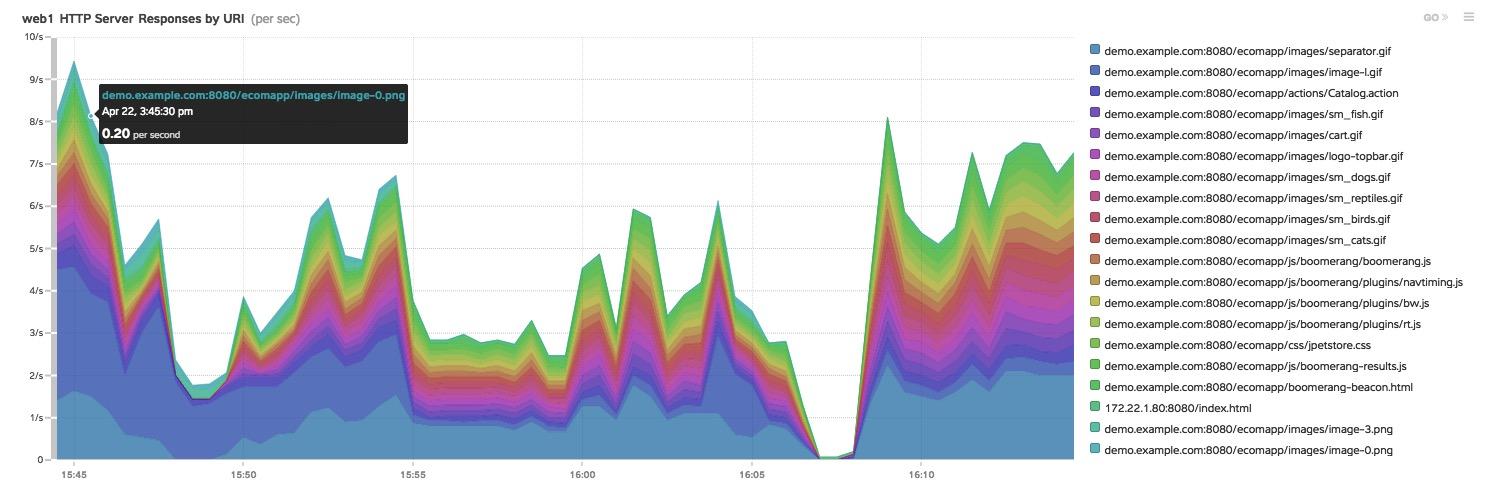
This area chart shows stacked information about the top 20 URIs in my environment, in one glance I can see overall HTTP traffic in this device group and the top 20 URIs.
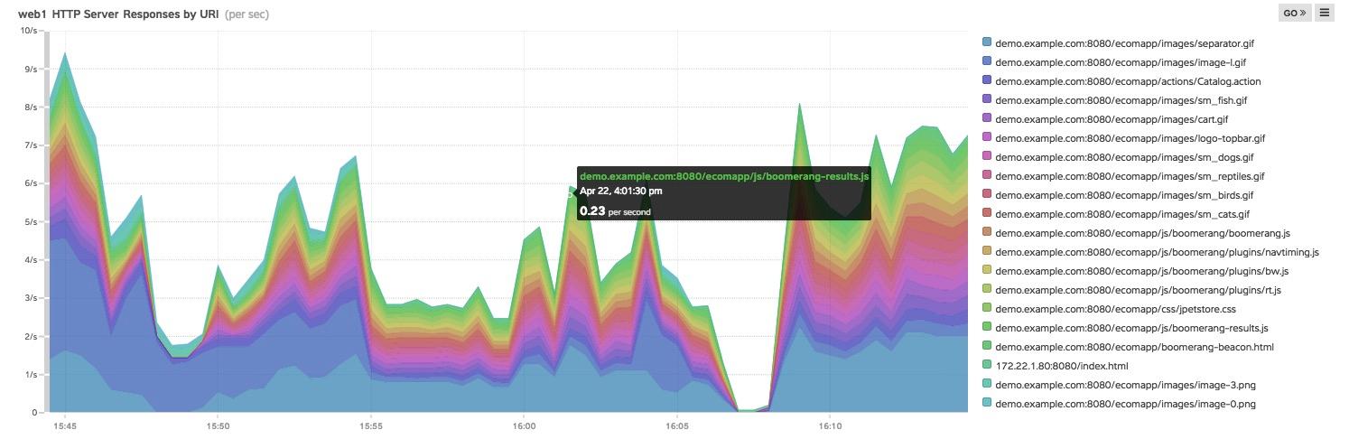
By hovering the cursor over any color and time combination, I can see exactly what the rate was for that URI at the time.
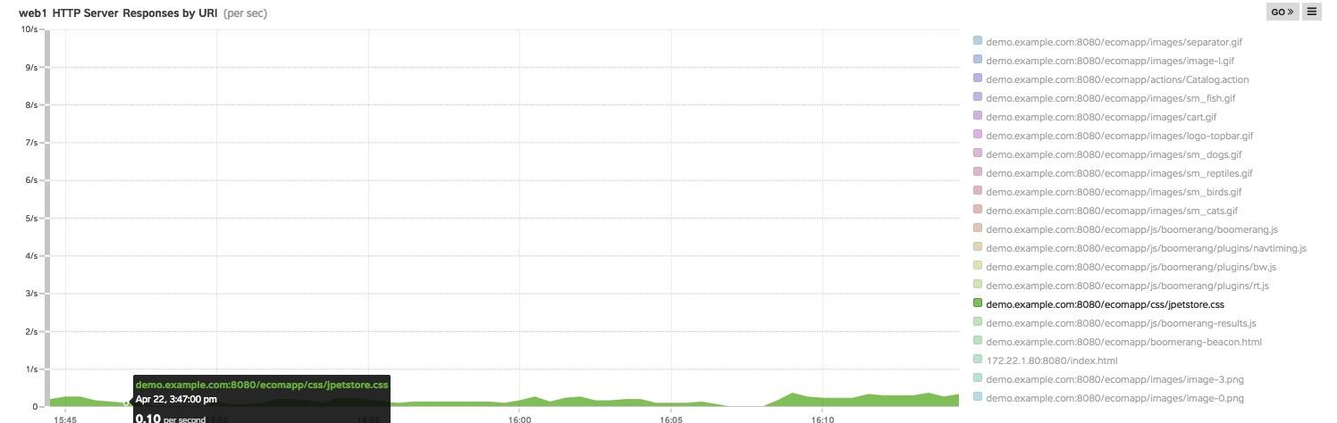
By clicking on a URI on the list I can see just that URI.
The area chart is an interactive and rich source of data, but at a glance, it may be difficult to get the information without interaction.
The Column and Bar Charts
The column and bar charts offer an alternative. Let's take a look at the same data in a bar chart format:
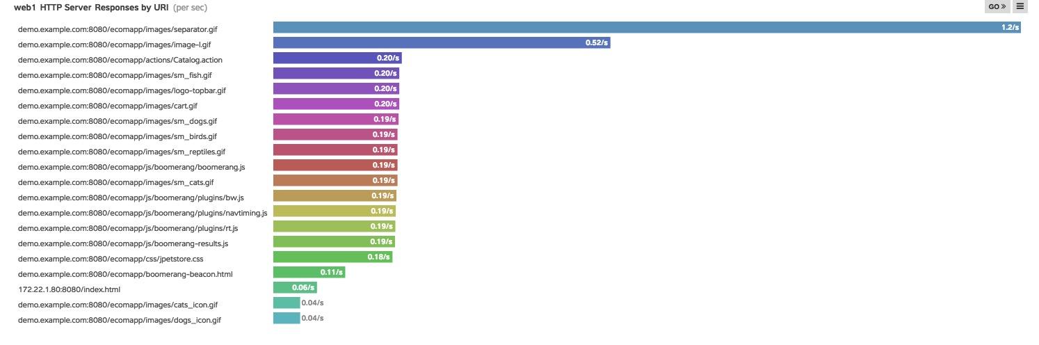
This bar chart is showing the same information about URIs over the last 30 minutes.
I can see that although there's the same information here, I can view it from a more static perspective that might be more informative for my operations team. The bar chart quickly reveals information that I wasn't seeing as clearly in the area chart. The top URI is "separator.gif" and it's taking hits at the rate of 1.4/s. This provides actionable data to me as an administrator. Perhaps "separator.gif" needs to be cached, moved to a CDN or have the web server expiration settings extended. I still have the drill-down capability with the bar chart, but the over-time view of the area chart has been traded for a clearer top-down view that brings different pieces of information into focus. In some cases I might even want the exact same metric shown to me using two different charts just to see these perceptual differences.
Line & Column Charts
Now let's take a look at another highly useful chart: the line & column. This chart type allows you to display two different metrics in one chart. Again, I am interested in HTTP statistics and with this chart type I can plot requests per second on my server and below it track errors.
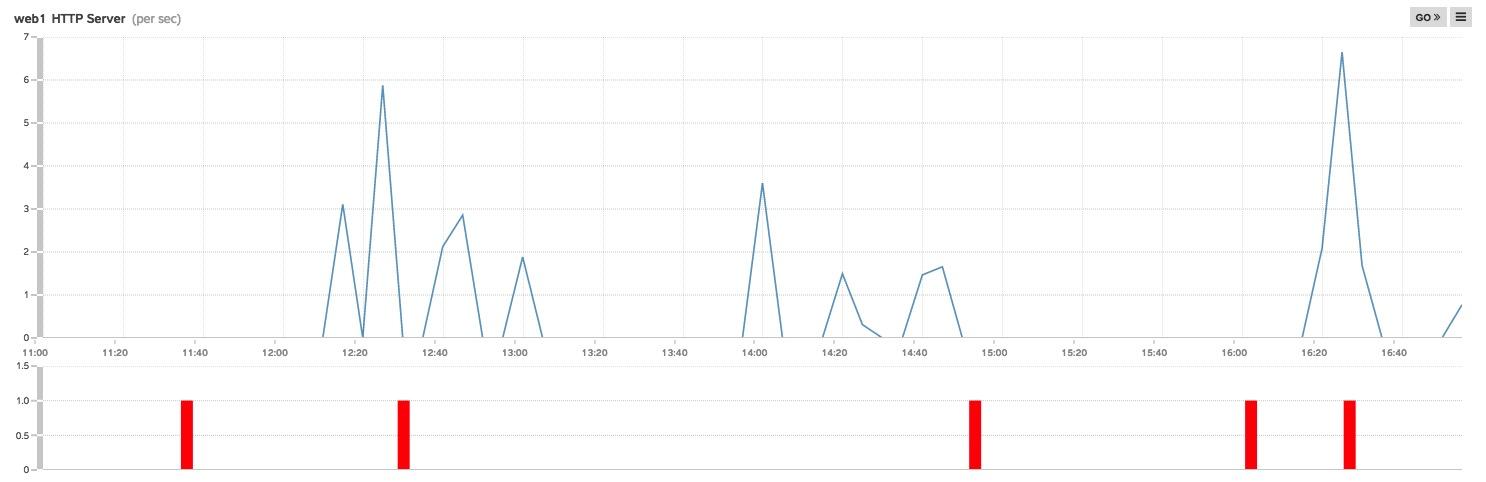
In this chart I am tracking HTTP requests on my web server along with errors.
It seems that every time I have had a spike in the last 30 minutes there has been a corresponding spike in errors. This type of chart makes correlation of two related pieces of data very easy. I can then click on "error," drill down and get to the root of the issue. With this type of chart, uncovering related issues becomes fairly trivial.
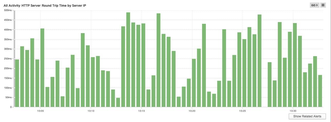
Candlestick Charts
Although it's difficult to have a favorite when it comes to chart types, when the candlestick is contextually appropriate, it's definitely one of my favorites. With this type I can quickly see outliers in a set of data because the outliers literally stick out.
In this example, I'm still building my HTTP dashboard and now I'm interested in the total round trip time of connections to my servers.
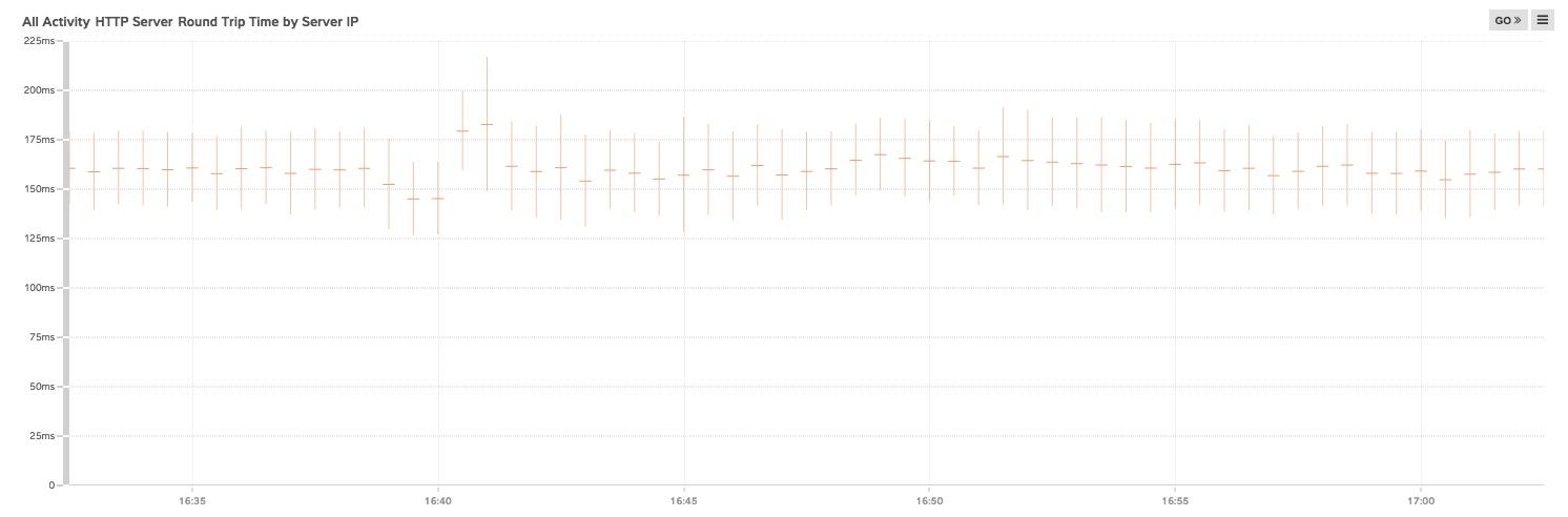
A candlestick chart showing HTTP activity on my network and the round trip time of servers in milliseconds.
This chart makes it immediately evident that right after 16:40 there was a spike that increased round trip time. By hovering my cursor over the line I can see the mean, the standard deviation above and below the mean. I can quickly see that the mean has increased by 20 to 40 milliseconds. Clicking on the candlestick takes me to the detailed metrics, which shows me that one of my servers experienced an increase in processing time during this window.
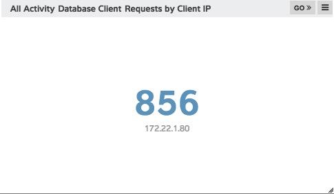
Single Value Charts
This is useful chart type to expose meaningful roll-up data that can be shown at a glance. Below we have charted the number of active database client requests, by client IP. 172.22.1.80 (which could be a critical client in our environment) has 856 open connections.
Status Charts
Many charts, including the status chart allow you to use ExtraHop alerts to control the color-coding. In this chart we see that the HTTP Server Round Trip time is nominal, but with an alert for large spikes, the bars would indicate the issue through color as well.
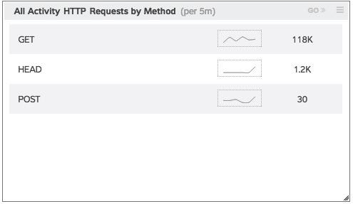
List Charts
Lists allow us to consolidate a large amount of information in a small space. Below I have charted HTTP request methods and I can quickly glance at the trend lines to see what the recent trends have been (per the time I've selected for the region). I can see for example that there has been a slight spike in HEAD requests. This could be unusual or interesting activity for me, and in either case a lot of information can be relayed in a very small space.
I hope that you will explore the various chart types available and provide your feedback to me about your experience using charts within ExtraHop dashboards. The capabilities are quite diverse and the creation of the dashboard is limited only by your imagination. My team is always working with product management and development to make these tools more intuitive and usable if you have any feedback feel free to send it to me at tme-feedback@extrahop.com.
In Part III of this blog series we will get into some more of the elements that go into making great dashboards.
Discover more


Sr. Technical Marketing Engineer
Nojan joined ExtraHop as a Sr. Technical Marketing Engineer in the summer of 2014. A veteran of Internet technology companies, he has been involved in one way or another with data over wires for over 30 years. While his hobby in networking began in 1984 with a 300 baud modem, his first paying job didn't come until a year later in 1985 when he started maintaining accounting systems on an Apple II for a local pharmacy. From there, his career in the industry has involved operations and system administration for consulting companies, for his own startup, and work for larger companies such as Apple, AOL, Seattle Times and Real Networks and vendors F5 Networks and Cisco Systems. For Nojan, the promise of ExtraHop is the promise of a platform that makes life better for every developer, operations analyst, network engineer, and system administrator, a world where knowledge is power provided by ExtraHop.