 Blog
Blog
Designing a Color System: Intuitive UX and Happy Developers
December 14, 2020
Color is a fundamental element of a user interface. Meaningfully applied color guides attention, unifies related elements, helps convey status and interactivity, and more. In our product we also offer light or dark themes as a user preference to match mood, situational lighting and accessibility.
As our product grew, so did our need for a mature design system so that designers and developers can deliver a better user experience. We had accrued a large, unruly set of hex colors and often redundant and inconsistently applied color variables. Adding to the problem, each UI theme had its own approach to color selection and differing contrast problems. Without a proper color system, designers and developers were forced to keep making ad-hoc decisions and adding to the design debt of excess colors and diverging themes.
Our old color ramp and practices were not cutting it anymore.
Color Problems
No Method to the Color Madness
We had a lot of colors: 245 color variables to be exact. Many of them were redundant or subtle variations of a single color. We were also missing whole sections of the spectrum, like warmer colors and purples. New color values and color variables had been inserted whenever it wasn't clear which existing color to use, and those new colors were often of slightly different hues than existing colors.
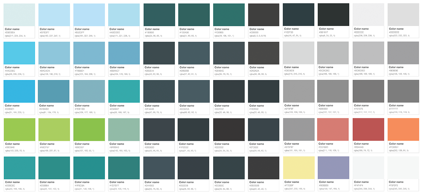
Colors obeyed their own rules and had many variations on the same color.
Colors Worked Differently in Different Themes
There was never a one-to-one relationship between colors when switching between light and dark themes. For example, in the dark theme we'd have diagram objects accented in teal while in the light theme they'd be accented in red. That could imply a completely different meaning in the user's eyes.


While color consistency is important for making an intuitive and efficient UI, a color functions differently in different themes. What works in dark themes might cause problems in another theme.
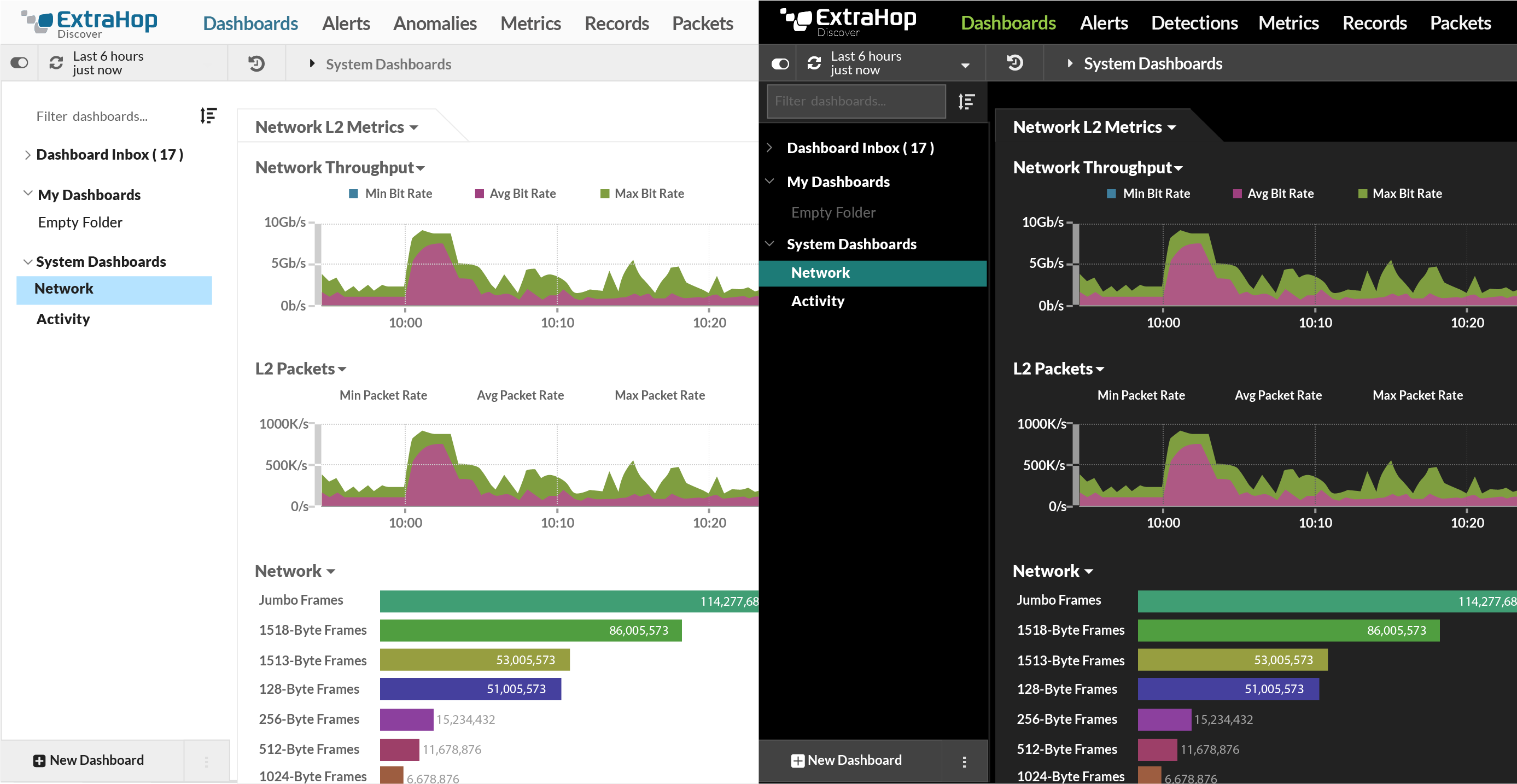
Light and dark themes.
Accessibility, Contrast, and the Color Quandary
Our system did not provide enough contrast in colors that were near each other to have an acceptable difference. Different elements in different themes lacked sufficient contrast for accessibility. They could likely blend into each other and make it difficult to read text on top of an object with a subtle color difference. We need a 4.5:1 ratio on type color to the object it sits on top to confirm our goal of WCAG 2.0 level compliance.
The Solution
We defined what was going to make a color system successful. It was hitting these three goals:
- Define a comprehensive but limited set of colors
- All color palettes should have the same range of lightness to darkness
- Colors should switch easily from theme to theme
Building a Better Palette
We started with our core colors and worked out from there. After doing some research about how other designers handled the problem, our solution was to change our current color ramp to have repeatable shading steps for each color from light to dark. To figure out the range, we started counting the colors that needed to be included in our new palette.
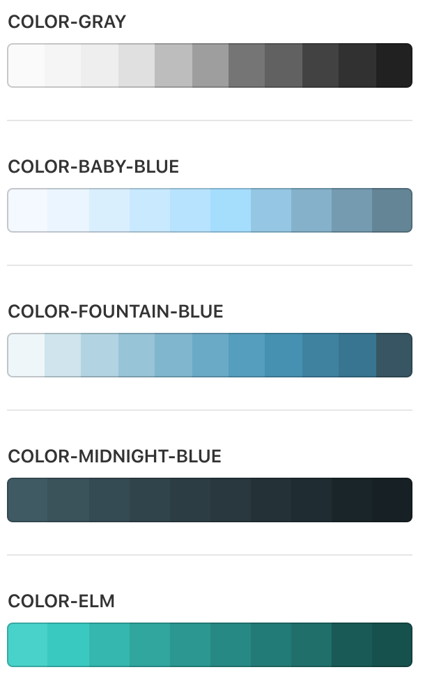
Our previous color ramp had inconsistent dark-to-light ranges across colors.
Some things needed to stay. Every theme had a primary background and foreground color as well as an accent color and status colors that needed to stay the same. We selected a single accent color to be applied across all themes so that we would only need to vary the shade of that color when switching between light and dark themes. From there we added purple which did not exist currently, our final palette had a range of 11 colors including white and black as a base color. Next, we needed to figure out how to make a new set of shades from each color that could repeat across each.
Predictable Range of Lightness to Darkness
The colors shades needed to be relative to the vibrancy of our primary colors. We chose a color space to work in which was HSB (hue, saturation, brightness). This allowed us to control the lightness and darkness separately from the color and we could keep that value as a near constant in the shades in the spectrum.
At first we tried making each step equal. This never gave us good results for making contrast rules. After an audit of the components, we realized that most of our important objects were at the top and bottom of the shades. We rarely had objects using middle shades so we could make larger leaps. On the top and the bottom, we would have shorter shade steps.
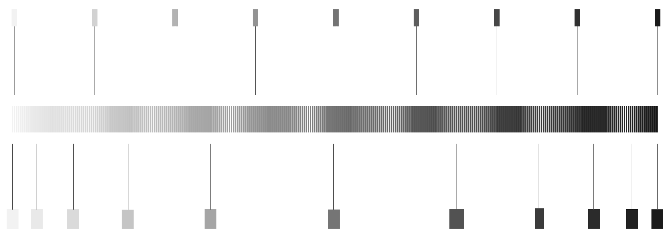
Smaller steps on the sides and larger in the middle has better contrast.
From here, we could create the rule, "If you take a color and put it on top of an object that is at least four shades away, it will always have sufficient contrast." This also is good for developers as they can immediately spot a problem with the color relationship on their own.
Make It Simple to Swap Colors
Since we've reduced the palette and have created predictable steps, we can apply it to the UI. We have two light and two dark themes. Now that our shades share intervals that are mirror images away from the center color, we can use the opposite value from the center of our shade ramp to color in the other themes in a consistent way. The only exception to this rule is how we layer in our dark themes versus light due to perceived darkness and depth. We also had to redefine our accent colors and where they were used to make sure that the rules could be applied everywhere.
Results
We arrived on a palette with a wide range of beautiful colors and space to grow into. Now if we change a color, we can also change the colors universally to relate to it and keep the same result.
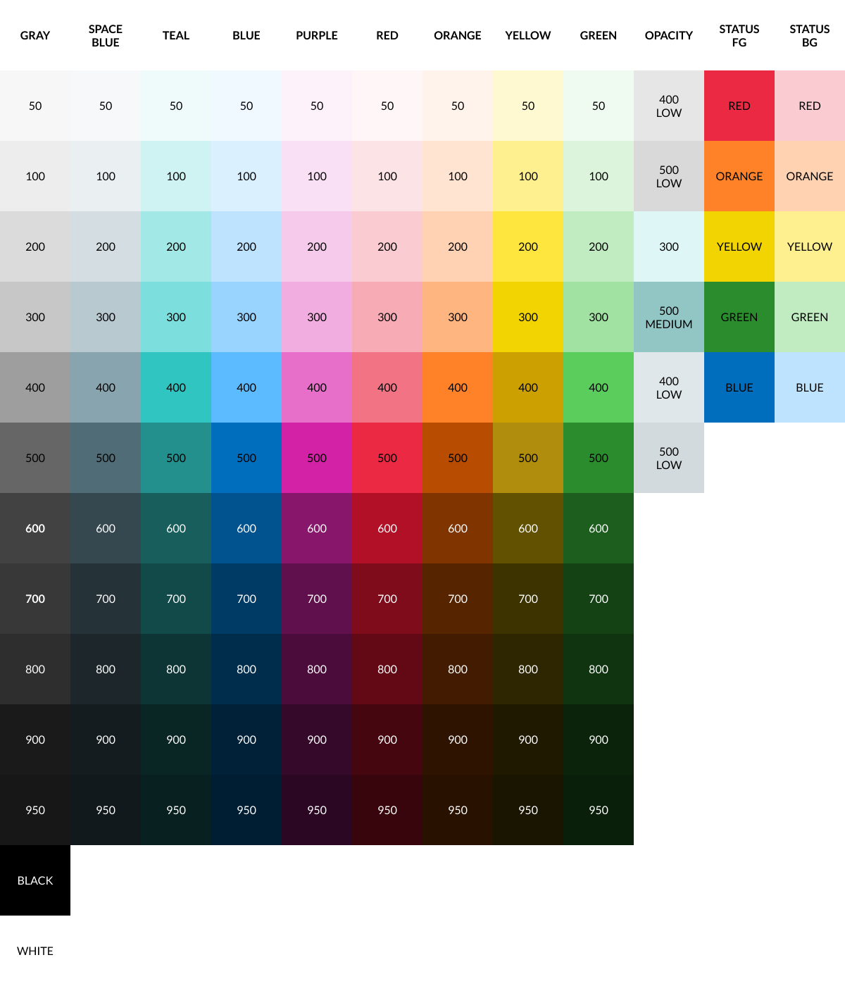
With the flexibility of our system, we were also able to add a new "high contrast" theme, for working in light environments or an old projector that washes everything out. Any situation where more contrast helps the user see it more clearly. The colors in our system now better meet compliance and we can choose matching the colors quickly that would meet the standard.

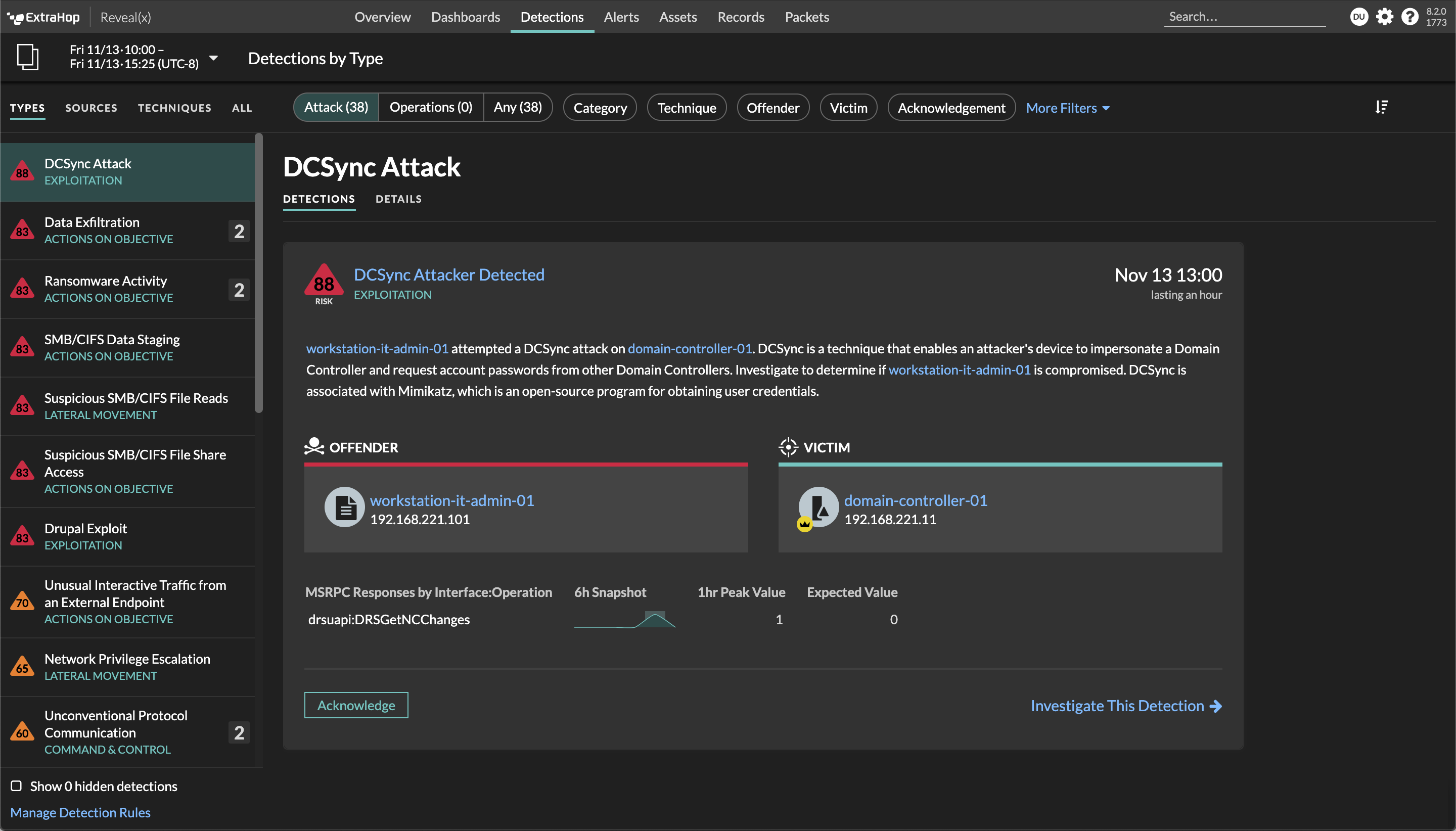
The developers are happy because we reduced the number of color variables from 245 to 34 and made choosing colors simple. It's also great for onboarding people because the system is now extremely simplified. And finally, these colors can swap super quickly with some basic rules.
Discover more
